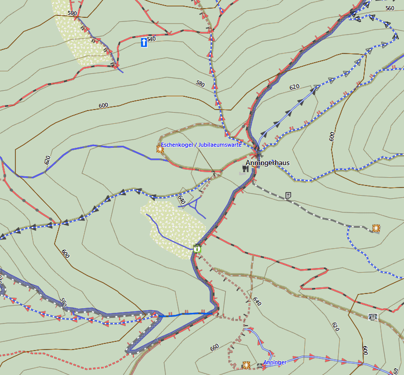
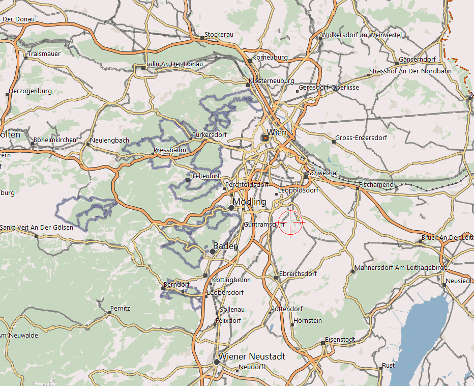
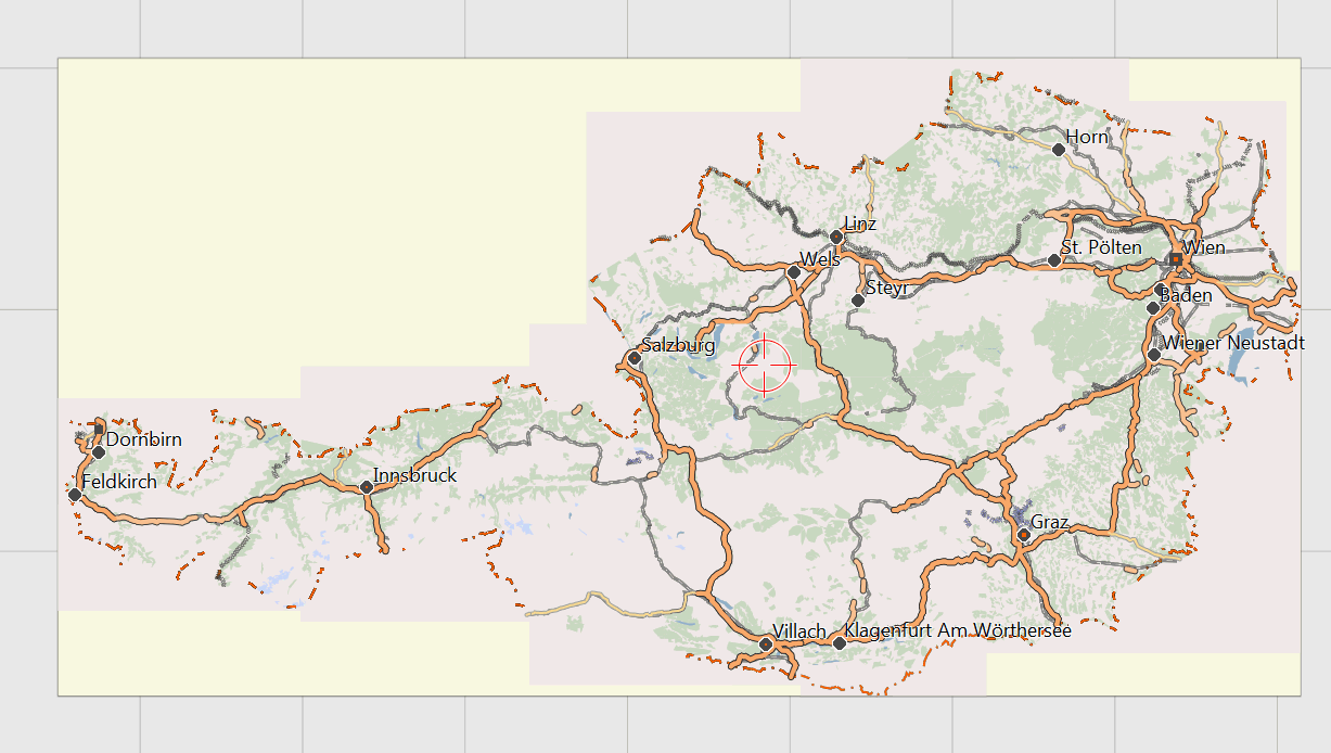
Just a collection of screenshots from Basecamp and Mapsource to give you an image on how the map looks like on your desktop. (note while you can choose to use the same layout on your GPS, it is recommended to use one of the 3 GPS layouts with higher contrast as they are easier to read with bad light conditions):
Note that the OpenMTBMap is a vector map that is drawn realtime on your PC/GPS. While raster maps are handdrawn and you would need one map for every resolution, vector maps are drawn realtime by your GPS/PC. This means that things like labels or density of streets/ways may be too much or too low. On the other hand vector maps are fully scalable, freely zoomable, rotatable (without letters being drawn upsidedown), autorouting capable, searchable, .... But hey, as you can see on the screenshots, the rendering quality is not far off from raster maps!


Following is a series of zooming into Germany Hamburg (1. shot: detail resolution from infinite to 70km)

(50-20km)

(15-10km)

(7-5km)

(3-2km resolution)

(1.5-1km resolution)

Note the following screenshot highlight too much information shown (the labels are not wisely chosen and interfere a bit) (700-300m resolution). But hey, on the zooming in phase this is basically the only one that is suboptimal.

This is the highest detail level (200m to 20m resolution). Note you can still zoom in closer without quality degradation of course. Only there is no more additional information showing up.

Oregon:
(classic layout first 2 screenshots, wide layout other Oregon screenshots).


Nüvi 200:

Gpsmap 62
(note low resolution on GPS makes screenshots look very small on screen), using "thin" layout (as recommended):


Vista HCx
using the "thin" layout. Note if you want to use it for mountainbiking, I recommend the "classic" layout, which has wider streets. For cycling inside a city, the "thin" layout is also okay however.
First zooming in from 5km overview to 50m detail. Note that the map is only so "crowded" because Vienna is a big city. On the countryside the map looks a bit cleaner while zooming in.
The blue flags are Points of interest saved locally to the GPS and not part of the map.


Example of riding alon a calculated route.


Hallo! Meine Mitgliedschaft ist abgelaufen, und ich würde vor dem Erneuern der Mitgliedschaft gerne wissen, ob Du in Deinem Kontingent Wanderkarten für die UK hast? Also Peak District, Lake District, Yorkshire Moors, zum Beispiel, auf 1:25k Auflösung, mit foot paths und bridle ways etc.? Das wäre wichtig, das zu wissen, bevor ich wieder beitrete.
Vielen Dank!
Karin
Die Karten basieren auf openstreetmap.org – allerdings stelle ich einige zusätzliche Details (vor allem zur Qualität von Wegen, bzw wohl auch ein klein bisserl mehr topographische Details) in den Karten dar – als du auf openstreetmap.org findest. UK ist generell recht gut gemapped – also sollten die Karten dort ziemlich gut sein. Generell ist eine klassische 1:25 Karte was topographie angeht aber meist besser – was Wege und Aktualität betrifft meist schlechter. UK ist natürlich als Karte herunterladbar.